
NAKAI Matcha
Visual Identity / Packaging Design移ろう瞬間に美を見出す、日本の美意識を纏った抹茶ブランド
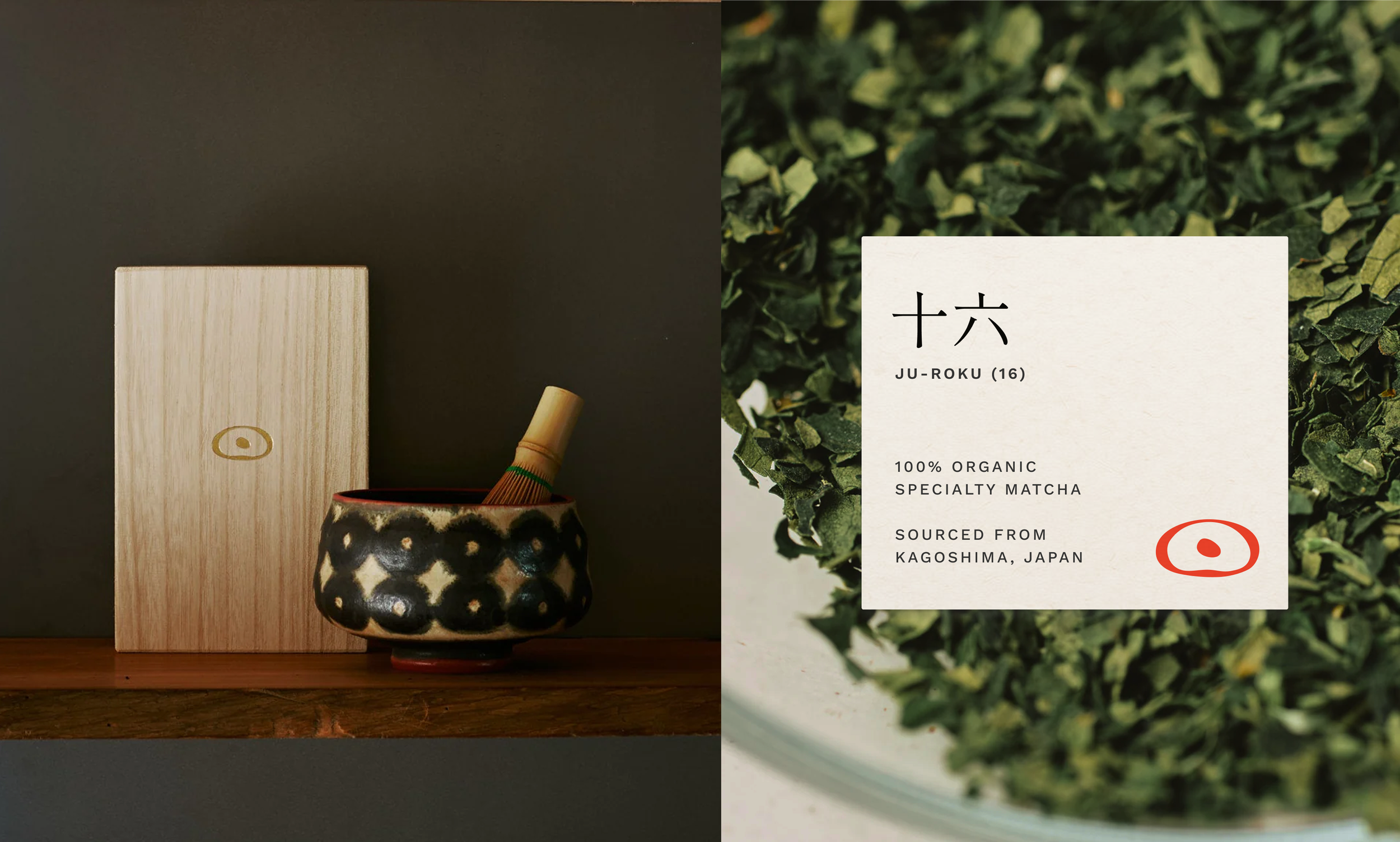
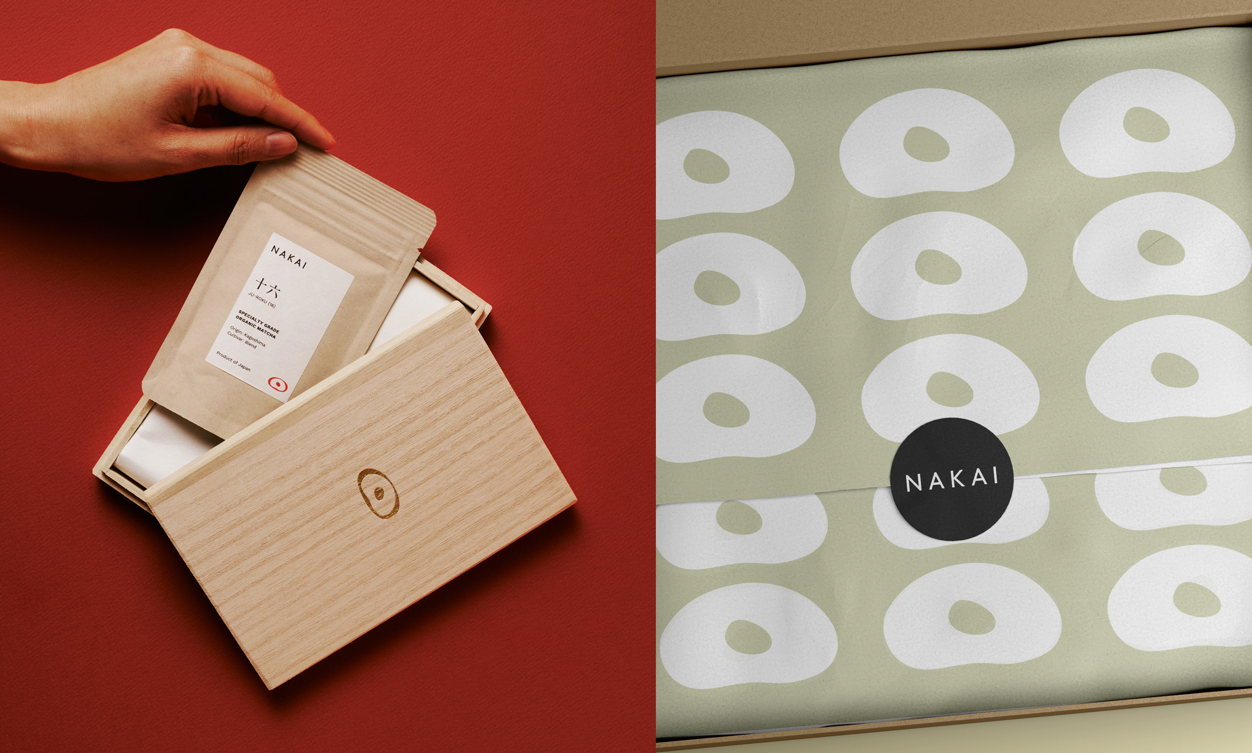
競争が激しさを増す抹茶市場で、NAKAIが差別化の軸に据えたのは「茶道精神」。最高品質のオーガニック抹茶を通して、これまでアメリカ市場になかった本物のクオリティと本質を届けるため、日本にルーツを持ちながらも海外の消費者に親しみやすい、新しいブランドネーム・ロゴ・ビジュアルアイデンティティ・パッケージシステムを一から構築しました。
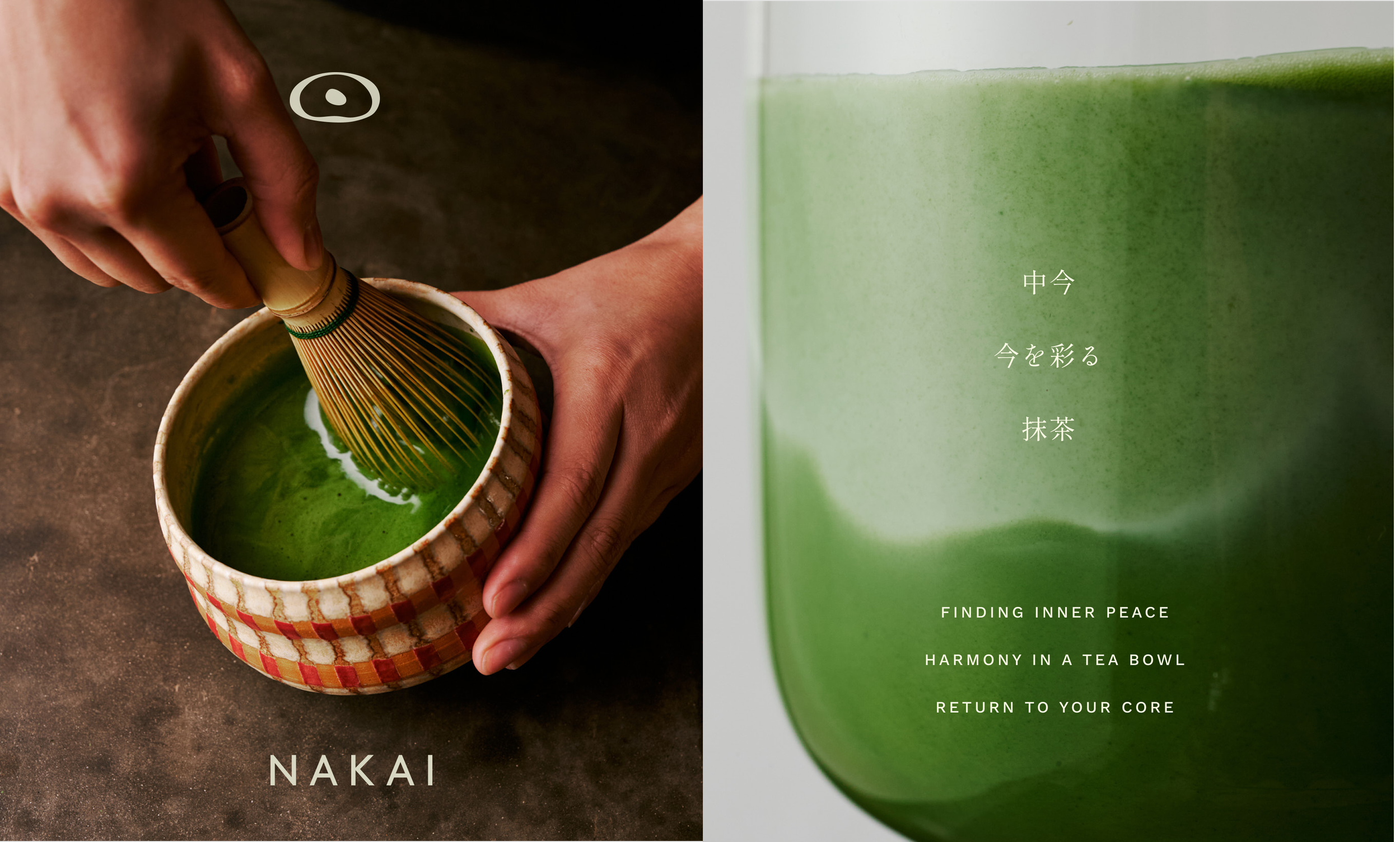
アイデンティティの起点となったのはブランドネーム。その核に据えたのが「中今(なかいま)」という言葉です。日々のささやかな瞬間に心を澄ませる。自然に癒やされる。一杯のお茶を通して、自分自身へと立ち返る——そうした「今、ここ」の感覚を形にしたのが、ロゴのアイコンです。
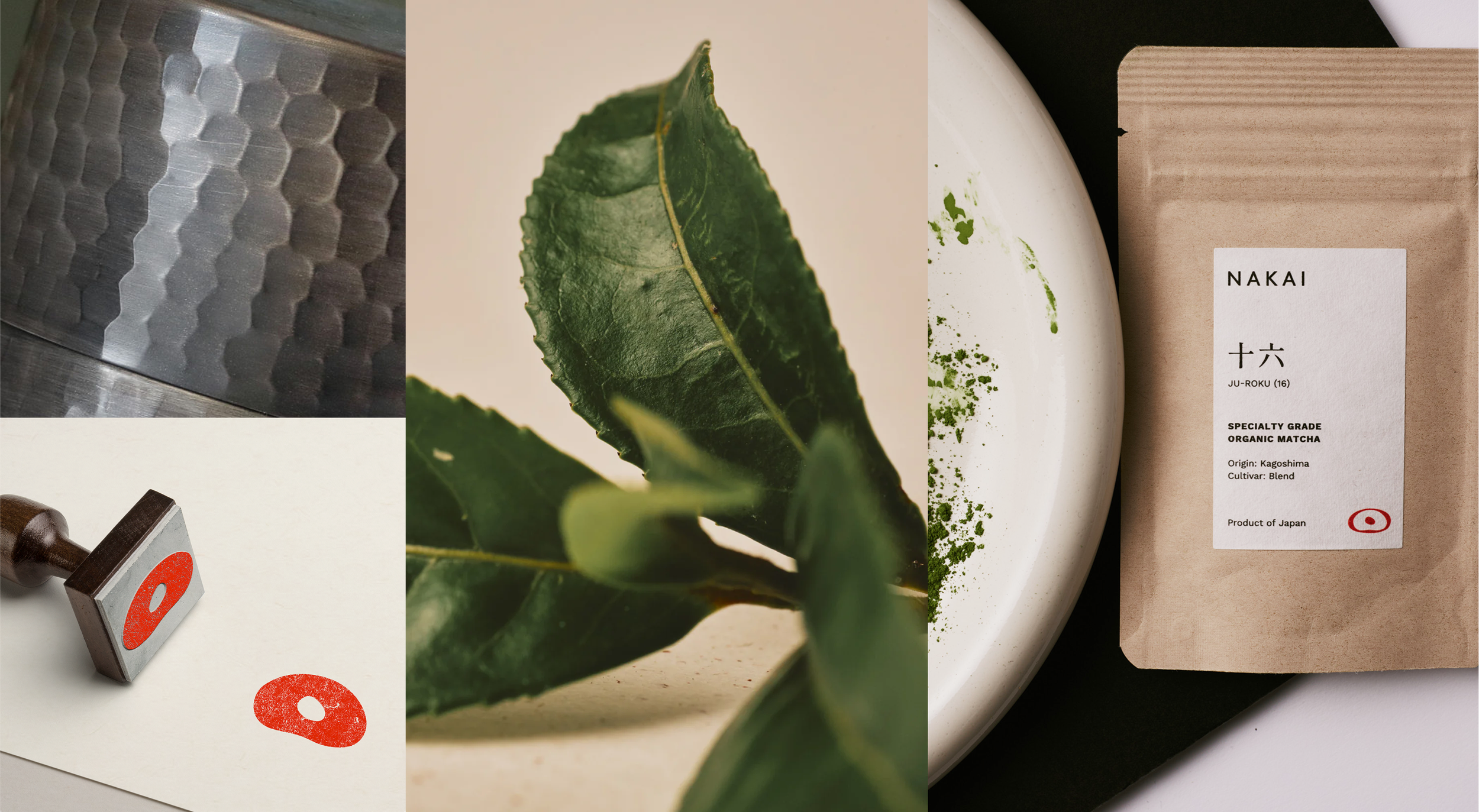
さらに「今を彩る抹茶」というコンセプトのもと、カラーパレットやアートディレクションにも緑一色にとどまらない広がりを持たせました。温かみのある茶色、和を感じさせる赤、そして手に触れた瞬間に伝わる質感まで——すべてが「中今」の世界観を支えています。
A Matcha Brand Built Around the Japanese Art of Being Present
In an increasingly competitive matcha market, NAKAI sets itself apart through the traditional Japanese spirit of sado — “the way of tea”. Offering the top 0.01% of highest-quality organic matcha, the brand needed a new name, logo, visual identity, and packaging system that felt authentically rooted in Japan yet welcoming and approachable to an American audience, delivering a level of quality and authenticity the U.S. market hadn't seen before.
It started with the name. At the heart of the identity is the word nakaima (中今)": a Japanese concept for being fully present in the “now”. Small daily rituals. The quiet comfort of nature. A single cup of tea that brings you back to yourself. That sense of presence is what shapes the icon at the center of the logo. Guided by the idea of "harmony in a tea bowl," the color palette and art direction move beyond green alone — warm earthy tones, a red hue that nods to Japanese aesthetics, and tactile textures you can almost feel. Together, they bring the spirit of nakaima to life.
Credits:
Photography: NAKAI